The reduction of social mixing in Italy following the lockdown
Authors:
Emanuele Pepe (1), Paolo Bajardi (1), Laetitia Gauvin (1), Filippo Privitera (2), Brennan Lake (2), Ciro Cattuto (1,3), Michele Tizzoni (1)
1. ISI Foundation
2. Cuebiq Inc.
3. University of Turin
Notice: this is preliminary analysis, has not yet been peer-reviewed and is updated daily as new data becomes available. This work is licensed under a Creative Commons Attribution 4.0 International License.
Updated 30 March 2020 23:00
Background
The mitigation measures enacted as part of the response to the unfolding COVID-19 pandemic are unprecedented in their breadth and societal burden. A major challenge in this situation is to quantitatively assess the impact of non-pharmaceutical interventions like mobility restrictions and social distancing, to better understand the ensuing reduction of mobility flows, individual mobility changes, and impact on contact patterns. Here, we report preliminary results on tackling the above challenges by using de-identified, large-scale data from a location intelligence company, Cuebiq, that has instrumented smartphone apps with high-accuracy location-data collection software. We focus our analysis on Italy, where the COVID-19 epidemic has already triggered an unprecedented and escalating series of restrictions on travel and individual mobility of citizens.
Data
Mobility data is provided by Cuebiq, a location intelligence, and measurement platform. Through its Data for Good program, Cuebiq provides access to aggregated and privacy-safe mobility data for academic research and humanitarian initiatives. This first-party data is collected from anonymized users who have opted-in to provide access to their location data anonymously, through a GDPR-compliant framework.
Location is collected anonymously from opted in users through smartphone applications. At the device level, iOS and Android operating systems combine various location data sources (e.g. GPS, wifi, beacons, network) and provide geographical coordinates with a given level of accuracy. Location accuracy is determined by the device and is variable, but can be as accurate as 10 meters.
Temporal sampling of anonymized users’ location is also variable and dependent on app/OS characteristics and on user behavioral patterns, but it has a high-frequency overall. We remove short-time dynamics by aggregating the data over 5-minute windows. The basic unit of information we process is an event of the form (anonymous hashed user id, time, latitude, longitude), plus additional non-personal metadata and location accuracy.
We selected a panel of users who were active during the first week of the outbreak (February 22-28, 2020). This leads to a sample of about 170k users with a total of about 200 million data points over the 10 weeks of study.
Methods
The average contact rate, or the number of unique contacts made by a person on a typical day is a fundamental quantity to model and understand infectious disease dynamics.
We evaluated the effect of interventions on the social mixing of our users’ sample, by defining a proxy of the potential encounters each user could have in one hour.
To this aim, we built a proximity network among users based on the locations they visited and the hour of the day when these visits occurred.
To create such a network, we assert proximity between any two users in the same province who were seen within a circle of radius R = 50 m in a 1-hour period.
The procedure to build the proximity network is described in the graph below.
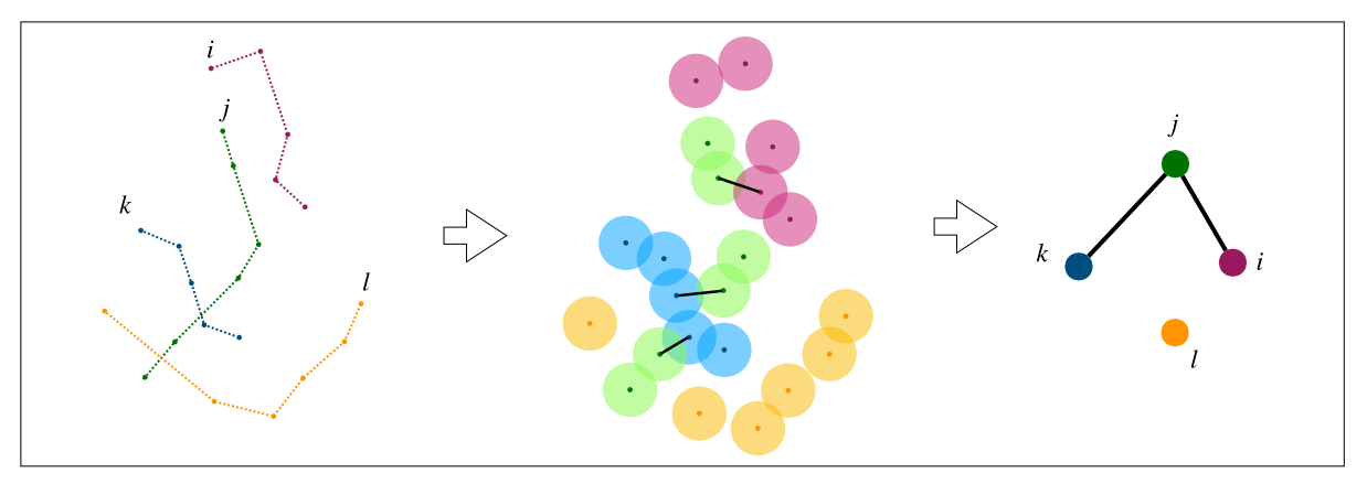
If two users have been in proximity several times in a day, this still counts as only one link in the network. To measure variations in the network structure over time, we look at the average degree of the network defined as <k> = 2E/N, where E is the number of links and N is the number of nodes of the network. It is important to remark that this is not a close-range contact network. Rather, it captures a looser notion of social mixing at the chosen spatial and temporal scales. A link between two nodes indicates the possibility that the corresponding individuals have had a close-range encounter during a given day.
Results
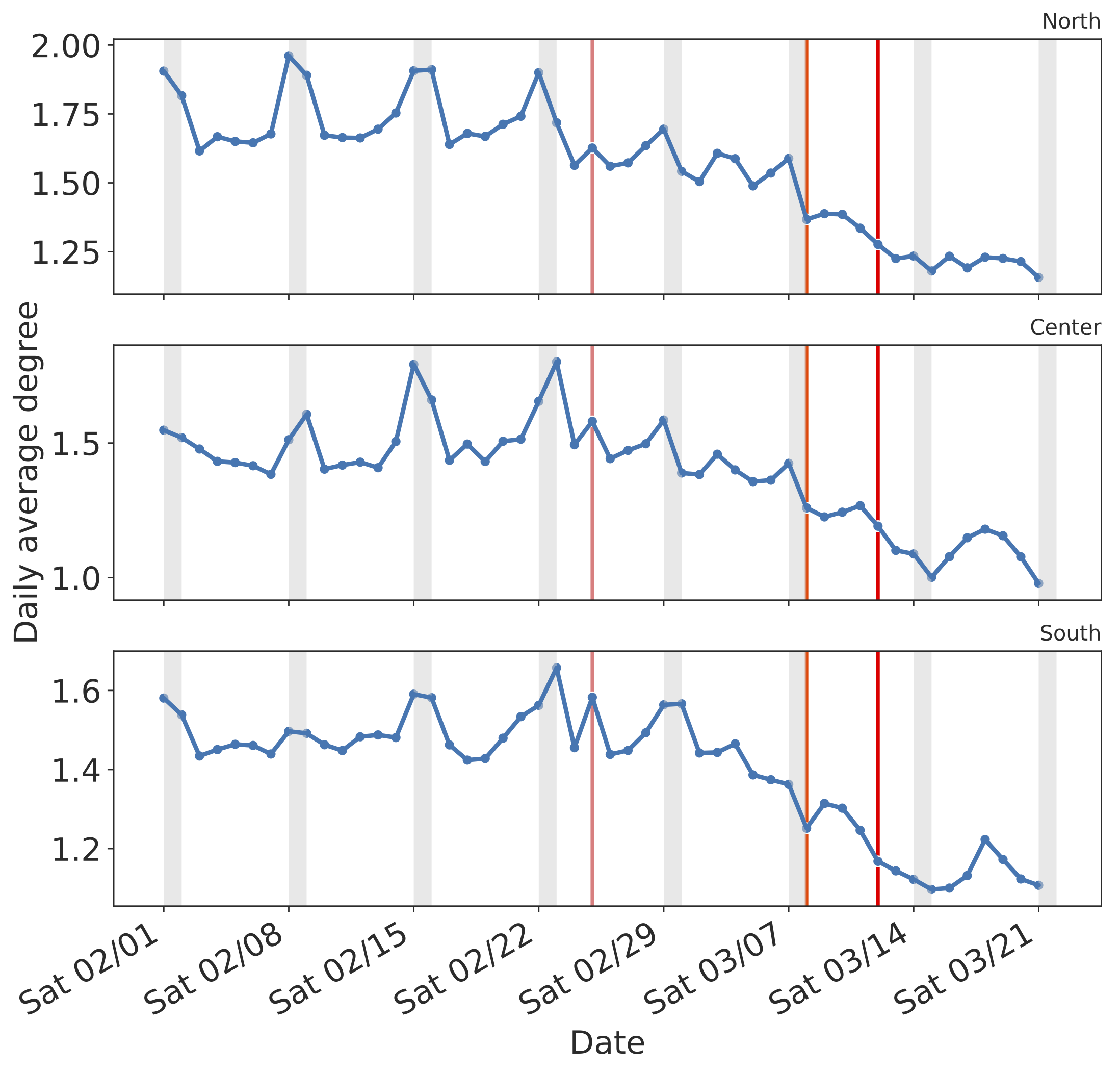
We look at how the average degree of the proximity network has evolved in time, comparing three macro-regions of Italy: North, Center, and South. The average degree has consistently declined since February 25, all over the Italian regions as shown in the figure below. Whereas, before the outbreak, differences in average degree were clearly visible between workdays and weekends, such differences appear to vanish after restrictions were rolled out by the Italian Government. The decline has somehow been faster in the North, due to the early implementation of the restrictions, but after the national lockdown imposed on March 11 the decline has been consistent everywhere. In the week of March 14-21, the value of <k> seems to have plateaued almost everywhere. In Central and Southern Italy, the average degree has slightly increased on March 17-18 but declined again in the following days.
In the figures below, red vertical lines highlight the start of three major interventions by the government:
- February 25, 2020: school closure and mobility restrictions imposed on Lombardy, Veneto, Piedmont, Emilia-Romagna, Liguria and Friuli.
- March 8, 2020: lockdown of the Lombardy region and additional provinces in Piedmont, Veneto, Emilia-Romagna, Marche.
- March 12, 2020: national lockdown.
Grey shaded areas correspond to weekends.
We compute the average degree of the network by considering two groups of users:
- all users, irrespective of their daily number of contacts.
- only users who had at least one contact in a day.
On March 21, the average degree of all users has declined from the pre-outbreak averages by 77% in the North, 76% in the Center and 70% in the South and the Islands.
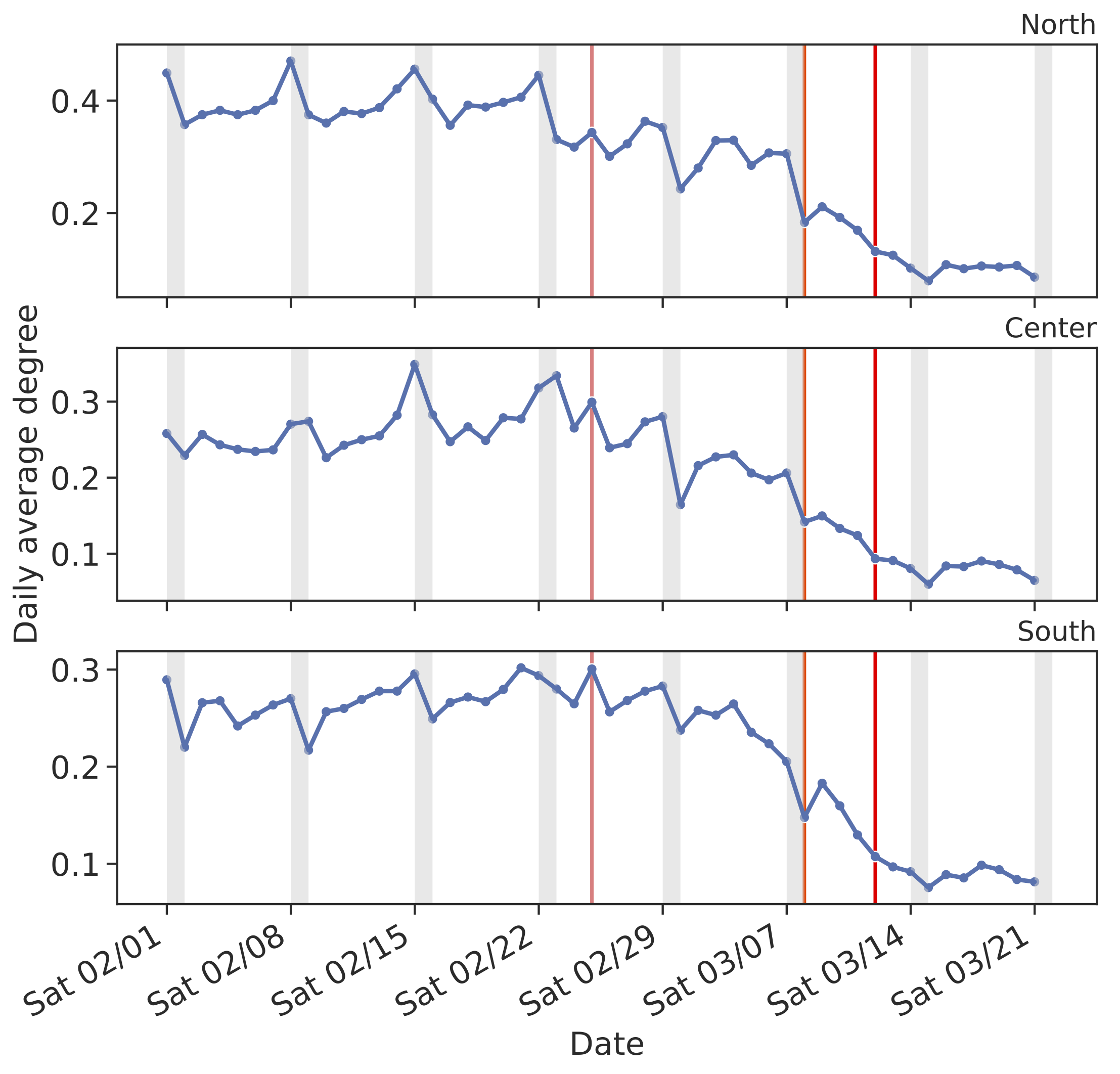
On March 21, the average degree of those users who had at least one contact in a day has declined from the pre-outbreak averages by 34% in the North, 34% in the Center and 25% in the South and the Islands.
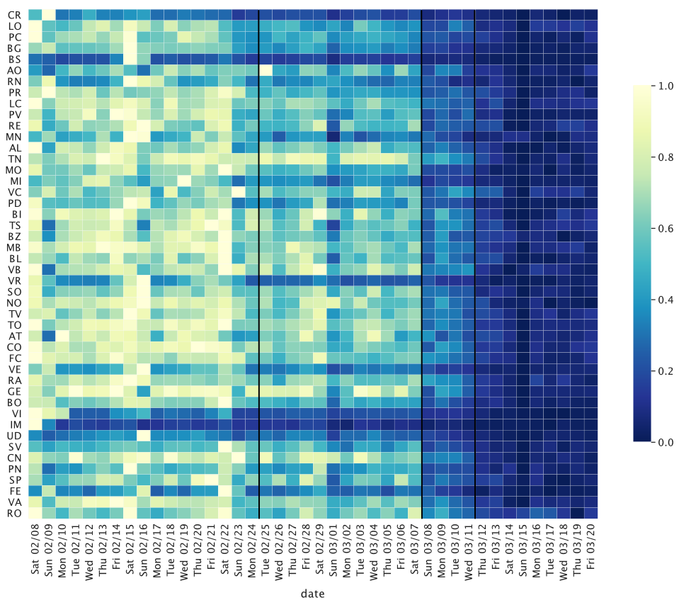
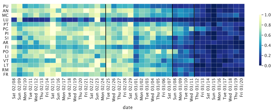
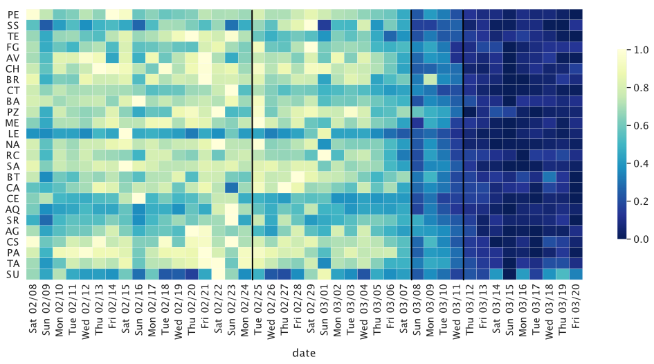
We further look at how the proximity of our users has changed in different provinces by computing the relative difference of the average degree from February 10 to March 20, 2020.
We report the average degree computed on all users in our panel.
For each province, the daily relative difference is defined as the difference between the average degree and its minimum over the study period normalized by the amplitude difference of the average degree over the same period (i.e the difference between the minimum and the maximum).
Northern Italy
While the relative difference of the average degree varies significantly in the first week of the outbreak among North provinces, there is a trend towards homogenization after the full lockdown and the closure of shops and restaurants.
Before the full lockdown, the average degree already reached a plateau in the provinces most strongly affected by the COVID-19 outbreak such as Bergamo (BG) or Brescia (BS), as shown in the figure below.
Provinces are ranked from top to bottom by the per-capita number of reported COVID-19 cases.
The black lines correspond to the three major interventions by the government listed above.
Central Italy
In Central Italy, the largest cities such as Rome (RM) and Florence (FI) have seen a strong and consistent decline in the average degree of the users’ proximity network, as shown in the chart below, especially after March 8. We observe a higher spatial and temporal heterogeneity in the average relative difference of <k>, with a stronger and uniform decline during weekends (such as March 14-15) and some relative increase during weekdays.
Southern Italy
In Southern Italy, a significant reduction in the average degree is observed only after March 11, 2020, when the national lockdown was imposed. However, in some provinces, like those of Naples (NA), Palermo (PA) and Bari (BA) - which represent the largest metropolitan areas of the region - a reduction was observed already since March 8. In the last week, starting on Monday 16, the reduction in the average degree seems to have plateaued.
Data Protection
This research was solely based on data from anonymized users who have opted-in to provide access to their location data anonymously, through a GDPR-compliant framework. The analysis never singled out identifiable individuals and no attempts were made to link these data to third party data about an individual. In order to preserve privacy, residential areas are inferred at an aggregated geohash level, thereby allowing for demographic analysis while obfuscating the true home location of anonymous users and prohibiting misuse of data.
Acknowledgments and Partnerships
This preliminary analysis is a collaboration between the ISI Foundation and Cuebiq Inc. Authors at ISI Foundation acknowledge support from the Lagrange Project funded by CRT Foundation and thank Cuebiq for access to a de-identified sample of its mobility data. In response to the COVID-19 crisis, Cuebiq is providing insights to academic and humanitarian groups through a multi-stakeholder data collaborative for timely and ethical analysis of aggregate human mobility patterns.